What is exploratory data analysis?
library(tidyverse)
library(palmerpenguins)
Exploratory data analysis (EDA) is often the first step to visualizing and transforming your data.1 Hadley Wickham defines EDA as an iterative cycle:
- Generate questions about your data
- Search for answers by visualising, transforming, and modeling your data
- Use what you learn to refine your questions and or generate new questions
- Rinse and repeat until you publish a paper
EDA is fundamentally a creative process - it is not an exact science. It requires knowledge of your data and a lot of time. At the most basic level, it involves answering two questions
- What type of variation occurs within my variables?
- What type of covariation occurs between my variables?
EDA relies heavily on visualizations and graphical interpretations of data. While statistical modeling provides a “simple” low-dimensional representation of relationships between variables, they generally require advanced knowledge of statistical techniques and mathematical principles. Visualizations and graphs are typically much more interpretable and easy to generate, so you can rapidly explore many different aspects of a dataset. The ultimate goal is to generate simple summaries of the data that inform your question(s). It is not the final stop in the data science pipeline, but still an important one.
Characteristics of exploratory graphs
Graphs generated through EDA are distinct from final graphs. You will typically generate dozens, if not hundreds, of exploratory graphs in the course of analyzing a dataset. Of these graphs, you may end up publishing one or two in a final format. One purpose of EDA is to develop a personal understanding of the data, so all your code and graphs should be geared towards that purpose. Important details that you might add if you were to publish a graph2 are not necessary in an exploratory graph. For example, say I want to explore how the flipper length of a penguin varies with it’s body mass size. An appropriate technique would be a scatterplot:
ggplot(
  data = penguins,
  mapping = aes(x = body_mass_g, y = flipper_length_mm)
) +
  geom_point() +
  geom_smooth()
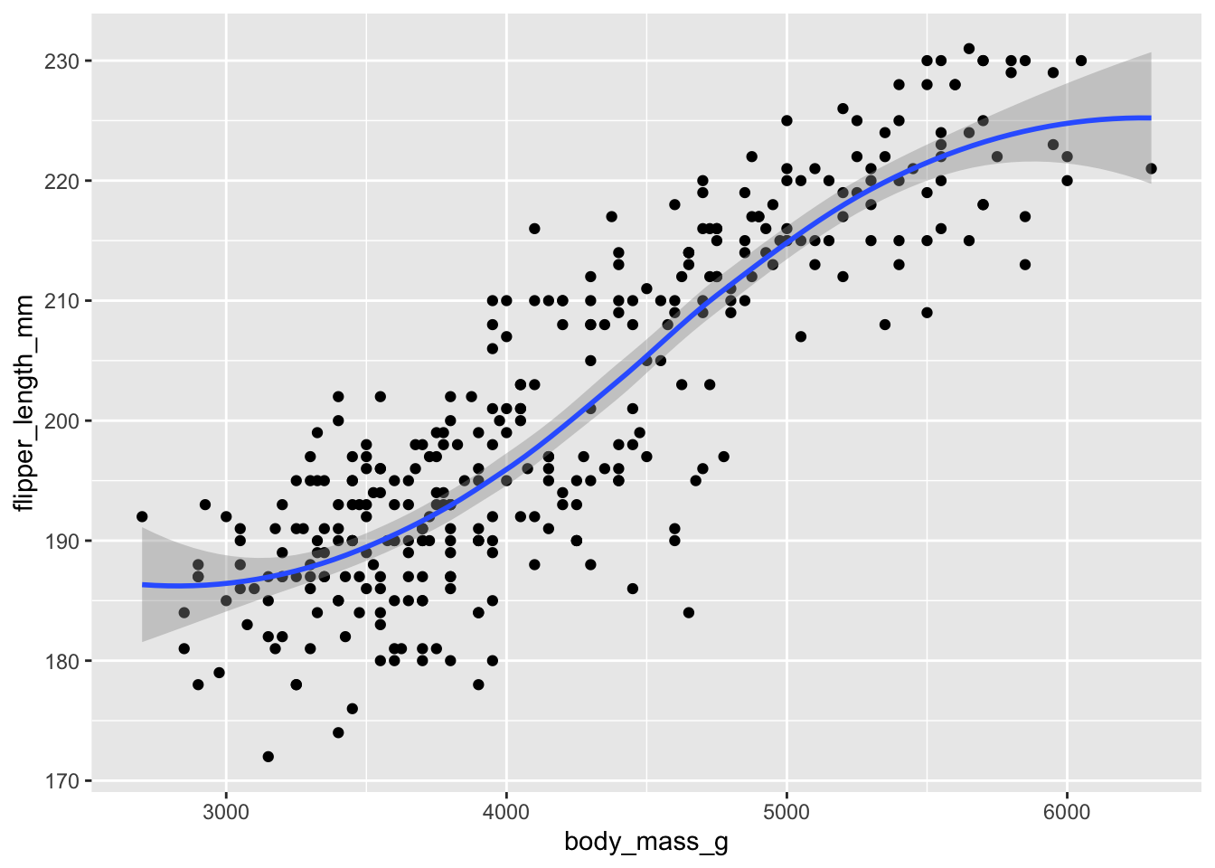
This is a great exploratory graph: it took just three lines of code and clearly establishes a positive relationship between the flipper length and body mass of a penguin. But what if I were publishing this graph in a research note? I would probably submit something to the editor that looks like this:
ggplot(
  data = penguins,
  mapping = aes(x = body_mass_g, y = flipper_length_mm)
) +
  geom_point(alpha = .1) +
  geom_smooth(se = FALSE) +
  labs(
    title = "Relationship between body mass and flipper length of a penguin",
    subtitle = "Sample of 344 penguins",
    x = "Body mass(g)",
    y = "Flipper length(mm)"
  ) +
  theme_minimal()
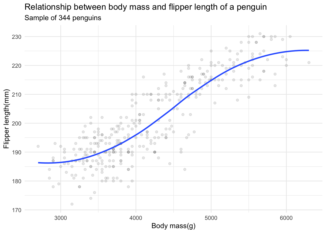
These additional details are very helpful in communicating the meaning of the graph, but take a substantial amount of time and code to write. For EDA, you don’t have to add this detail to every exploratory graph.
Scorecard
The Department of Education collects annual statistics on colleges and universities in the United States. I have included a subset of this data from 2018-19 in the rcis library from GitHub. Here let’s examine the data to answer the following question: how does cost of attendance vary across universities?
Import the data
The scorecard dataset is included as part of the rcis library:
library(rcis)
data("scorecard")

scorecard
## # A tibble: 1,732 × 14
## unitid name state type admrate satavg cost netcost avgfa…¹ pctpell compr…²
## <dbl> <chr> <chr> <fct> <dbl> <dbl> <dbl> <dbl> <dbl> <dbl> <dbl>
## 1 100654 Alab… AL Publ… 0.918 939 23053 14990 69381 0.702 0.297
## 2 100663 Univ… AL Publ… 0.737 1234 24495 16953 99441 0.351 0.634
## 3 100706 Univ… AL Publ… 0.826 1319 23917 15860 87192 0.254 0.577
## 4 100724 Alab… AL Publ… 0.969 946 21866 13650 64989 0.763 0.328
## 5 100751 The … AL Publ… 0.827 1261 29872 22597 92619 0.177 0.711
## 6 100830 Aubu… AL Publ… 0.904 1082 19849 13987 71343 0.464 0.340
## 7 100858 Aubu… AL Publ… 0.807 1300 31590 24104 96642 0.146 0.791
## 8 100937 Birm… AL Priv… 0.538 1230 32095 22107 56646 0.236 0.691
## 9 101189 Faul… AL Priv… 0.783 1066 34317 20715 54009 0.488 0.329
## 10 101365 Herz… AL Priv… 0.783 NA 30119 26680 54684 0.706 0.28
## # … with 1,722 more rows, 3 more variables: firstgen <dbl>, debt <dbl>,
## # locale <fct>, and abbreviated variable names ¹avgfacsal, ²comprate
glimpse(x = scorecard)
## Rows: 1,732
## Columns: 14
## $ unitid    <dbl> 100654, 100663, 100706, 100724, 100751, 100830, 100858, 1009…
## $ name      <chr> "Alabama A & M University", "University of Alabama at Birmin…
## $ state     <chr> "AL", "AL", "AL", "AL", "AL", "AL", "AL", "AL", "AL", "AL", …
## $ type      <fct> "Public", "Public", "Public", "Public", "Public", "Public", …
## $ admrate   <dbl> 0.9175, 0.7366, 0.8257, 0.9690, 0.8268, 0.9044, 0.8067, 0.53…
## $ satavg    <dbl> 939, 1234, 1319, 946, 1261, 1082, 1300, 1230, 1066, NA, 1076…
## $ cost      <dbl> 23053, 24495, 23917, 21866, 29872, 19849, 31590, 32095, 3431…
## $ netcost   <dbl> 14990, 16953, 15860, 13650, 22597, 13987, 24104, 22107, 2071…
## $ avgfacsal <dbl> 69381, 99441, 87192, 64989, 92619, 71343, 96642, 56646, 5400…
## $ pctpell   <dbl> 0.7019, 0.3512, 0.2536, 0.7627, 0.1772, 0.4644, 0.1455, 0.23…
## $ comprate  <dbl> 0.2974, 0.6340, 0.5768, 0.3276, 0.7110, 0.3401, 0.7911, 0.69…
## $ firstgen  <dbl> 0.3658281, 0.3412237, 0.3101322, 0.3434343, 0.2257127, 0.381…
## $ debt      <dbl> 15250, 15085, 14000, 17500, 17671, 12000, 17500, 16000, 1425…
## $ locale    <fct> City, City, City, City, City, City, City, City, City, Suburb…
Each row represents a different four-year college or university in the United States. cost identifies the average annual total cost of attendance.
Assessing variation
Assessing variation requires examining the values of a variable as they change from measurement to measurement. Here, let’s examine variation in cost of attendance and related variables using a few different graphical techniques.
Histogram
ggplot(
  data = scorecard,
  mapping = aes(x = cost)
) +
  geom_histogram()
## `stat_bin()` using `bins = 30`. Pick better value with `binwidth`.
## Warning: Removed 54 rows containing non-finite values (stat_bin).
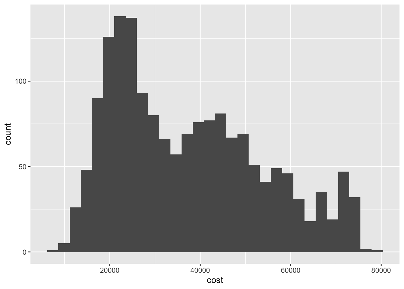
It appears there are three sets of peak values for cost of attendance, around 20,000, 40,000, and 65,000 dollars in declining overall frequency. This could suggest some underlying factor or set of differences between the universities that clusters them into separate groups based on cost of attendance.
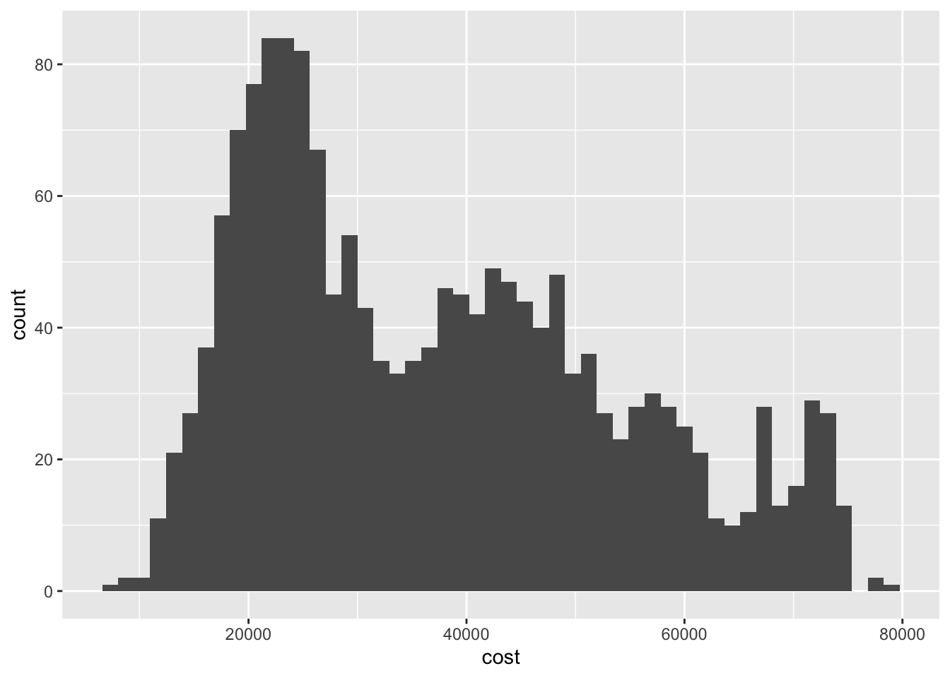
By default, geom_histogram() bins the observations into 30 intervals of equal width. You can adjust this using the bins parameter:
ggplot(
  data = scorecard,
  mapping = aes(x = cost)
) +
  geom_histogram(bins = 50)
## Warning: Removed 54 rows containing non-finite values (stat_bin).
ggplot(
  data = scorecard,
  mapping = aes(x = cost)
) +
  geom_histogram(bins = 10)
## Warning: Removed 54 rows containing non-finite values (stat_bin).
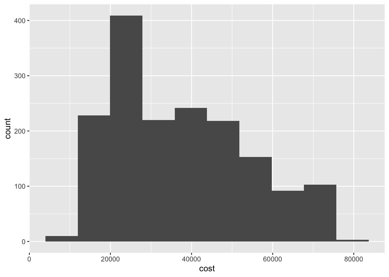
Different bins can lead to different inferences about the data. Here if we set a larger number of bins, the overall picture seems to be the same - the distribution is trimodal. But if we collapse the number of bins to 10, we lose the clarity of each of these peaks.
Bar chart
ggplot(
  data = scorecard,
  mapping = aes(x = type)
) +
  geom_bar()
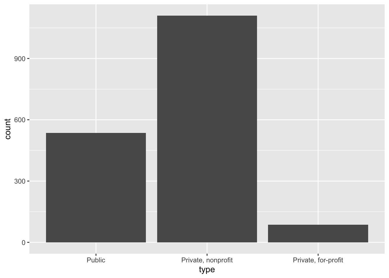
To examine the distribution of a categorical variable, we can use a bar chart. Here we see the most common type of four-year college is a private, nonprofit institution.
Covariation
Covariation is the tendency for the values of two or more variables to vary together in a related way. Visualizing data in two or more dimensions allows us to assess covariation and differences in variation across groups. There are a few major approaches to visualizing two dimensions:
- Two-dimensional graphs
- Multiple window plots
- Utilizing additional channels
Two-dimensional graphs
Two-dimensional graphs are visualizations that are naturally designed to visualize two variables. For instance, if you have a discrete variable and a continuous variable, you could use a box plot to visualize the distribution of the values of the continuous variable for each category in the discrete variable:
ggplot(
  data = scorecard,
  mapping = aes(x = type, y = cost)
) +
  geom_boxplot()
## Warning: Removed 54 rows containing non-finite values (stat_boxplot).
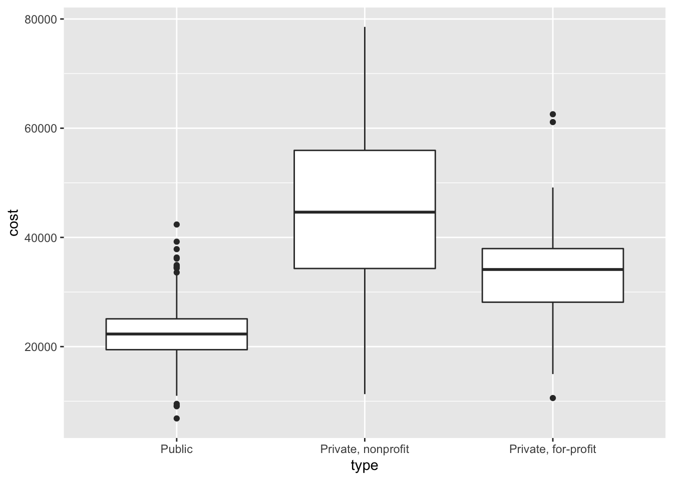
Here we see that on average, public universities are least expensive, followed by private for-profit institutions. I was somewhat surprised by this since for-profit institutions by definition seek to generate a profit, so wouldn’t they be the most expensive? But perhaps this makes sense, because they have to attract students so need to offer a better financial value than competing nonprofit or public institutions. Is there a better explanation for these differences? Another question you could explore after viewing this visualization.
If you have two continuous variables, you may use a scatterplot which maps each variable to an $x$ or $y$-axis coordinate. Here we visualize the relationship between annual cost of attendance (sticker price) and net cost of attendance (average amount actually paid by a student):
ggplot(
  data = scorecard,
  mapping = aes(x = cost, y = netcost)
) +
  geom_point()
## Warning: Removed 54 rows containing missing values (geom_point).
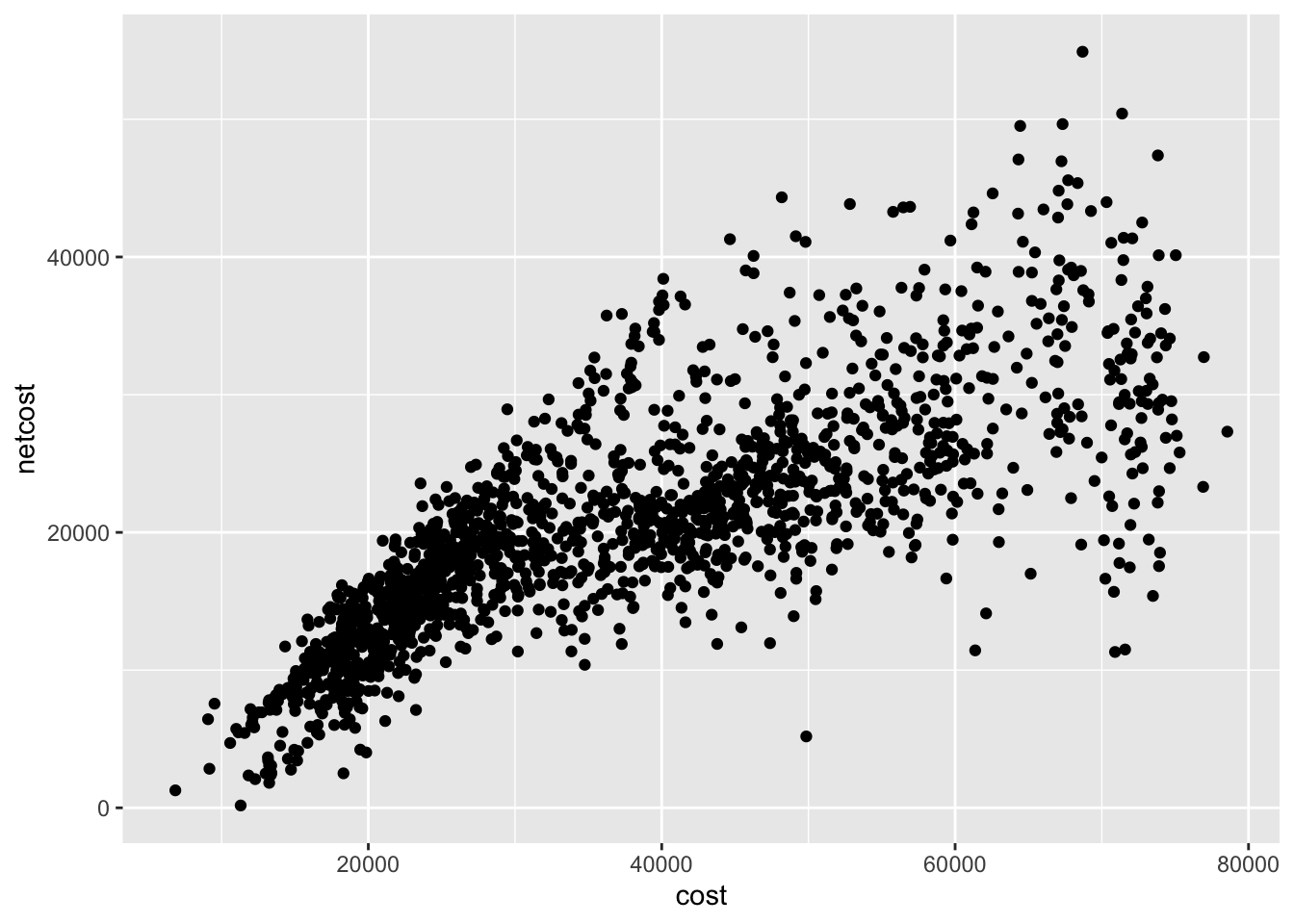
As the sticker price increases, the net cost also increases though with significant variation. Some schools have a much lower net cost than their advertised price.
Multiple window plots
Sometimes you want to compare the conditional distribution of a variable across specific groups or subsets of the data. To do that, we implement a multiple window plot (also known as a trellis or facet graph). This involves drawing the same plot repeatedly, using a separate window for each category defined by a variable. For instance, if we want to examine variation in cost of attendance separately for college type, we could draw a graph like this:
ggplot(
  data = scorecard,
  mapping = aes(x = cost)
) +
  geom_histogram() +
  facet_wrap(facets = vars(type))
## `stat_bin()` using `bins = 30`. Pick better value with `binwidth`.
## Warning: Removed 54 rows containing non-finite values (stat_bin).
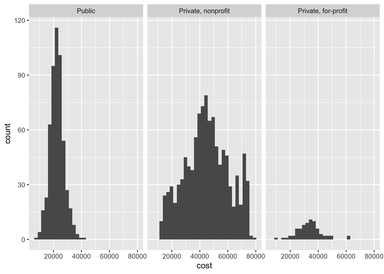
This helps answer one of our earlier questions. Colleges in the 20,000 dollar range tend to be public universities, while the heaps around 40,000 and 65,000 dollars are from private nonprofits.
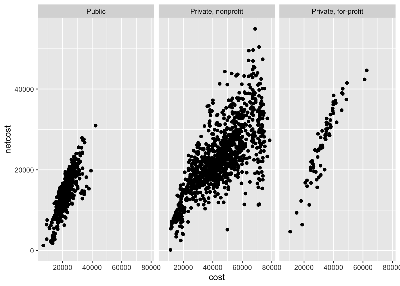
You may also want to use a multiple windows plot with a two-dimensional graph. For example, the relationship between annual cost and net cost of attendance by college type:
ggplot(
  data = scorecard,
  mapping = aes(x = cost, y = netcost)
) +
  geom_point() +
  facet_wrap(facets = vars(type))
## Warning: Removed 54 rows containing missing values (geom_point).
Utilizing additional channels
If you want to visualize three or more dimensions of data without resorting to 3D animations3 or window plots, the best approach is to incorporate additional channels into the visualization. Channels are used to encode variables inside of a graphic. For instance, a scatterplot uses vertical and horizontal spatial position channels to encode the values for two variables in a visually intuitive manner.
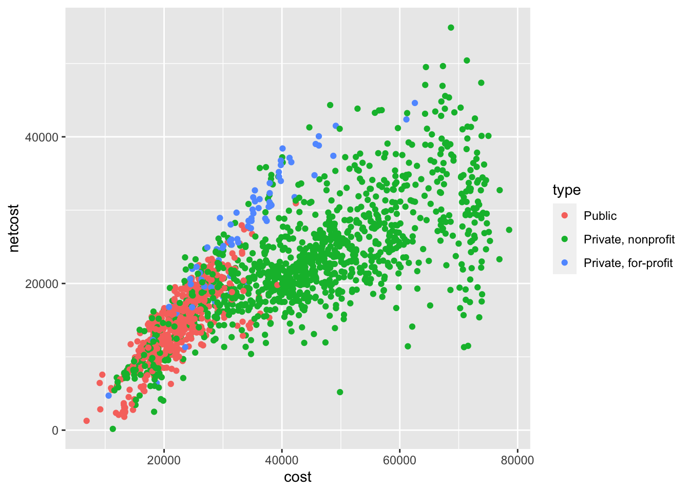
Depending on the type of graph and variables you wish to encode, there are several different channels you can use to encode additional information. For instance, color can be used to distinguish between classes in a categorical variable.
ggplot(
  data = scorecard,
  mapping = aes(
    x = cost,
    y = netcost,
    color = type
  )
) +
  geom_point()
## Warning: Removed 54 rows containing missing values (geom_point).
We can even use a fourth channel to communicate another variable (median debt load after leaving school) by making use of the size channel:
ggplot(
  data = scorecard,
  mapping = aes(
    x = cost,
    y = netcost,
    color = type,
    size = debt
  )
) +
  geom_point()
## Warning: Removed 136 rows containing missing values (geom_point).
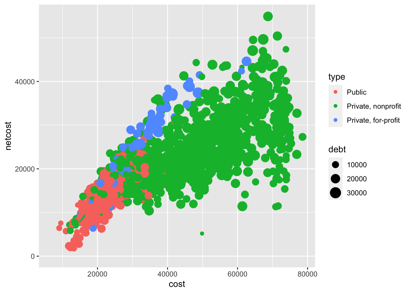
Note that some channels are not always appropriate, even if they can technically be implemented. For example, the graph above has become quite challenging to read due to so many overlapping data points. Just because one can construct a graph does not mean one should construct a graph.
Acknowledgments
- Artwork by @allison_horst
Session Info
sessioninfo::session_info()
## ─ Session info ───────────────────────────────────────────────────────────────
##  setting  value
##  version  R version 4.2.1 (2022-06-23)
##  os       macOS Monterey 12.3
##  system   aarch64, darwin20
##  ui       X11
##  language (EN)
##  collate  en_US.UTF-8
##  ctype    en_US.UTF-8
##  tz       America/New_York
##  date     2022-10-05
##  pandoc   2.18 @ /Applications/RStudio.app/Contents/MacOS/quarto/bin/tools/ (via rmarkdown)
##
## ─ Packages ───────────────────────────────────────────────────────────────────
##  package        * version    date (UTC) lib source
##  assertthat       0.2.1      2019-03-21 [2] CRAN (R 4.2.0)
##  backports        1.4.1      2021-12-13 [2] CRAN (R 4.2.0)
##  blogdown         1.10       2022-05-10 [2] CRAN (R 4.2.0)
##  bookdown         0.27       2022-06-14 [2] CRAN (R 4.2.0)
##  broom            1.0.0      2022-07-01 [2] CRAN (R 4.2.0)
##  bslib            0.4.0      2022-07-16 [2] CRAN (R 4.2.0)
##  cachem           1.0.6      2021-08-19 [2] CRAN (R 4.2.0)
##  cellranger       1.1.0      2016-07-27 [2] CRAN (R 4.2.0)
##  cli              3.4.0      2022-09-08 [1] CRAN (R 4.2.0)
##  codetools        0.2-18     2020-11-04 [2] CRAN (R 4.2.1)
##  colorspace       2.0-3      2022-02-21 [2] CRAN (R 4.2.0)
##  crayon           1.5.1      2022-03-26 [2] CRAN (R 4.2.0)
##  DBI              1.1.3      2022-06-18 [2] CRAN (R 4.2.0)
##  dbplyr           2.2.1      2022-06-27 [2] CRAN (R 4.2.0)
##  digest           0.6.29     2021-12-01 [2] CRAN (R 4.2.0)
##  dplyr          * 1.0.9      2022-04-28 [2] CRAN (R 4.2.0)
##  ellipsis         0.3.2      2021-04-29 [2] CRAN (R 4.2.0)
##  evaluate         0.16       2022-08-09 [1] CRAN (R 4.2.1)
##  fansi            1.0.3      2022-03-24 [2] CRAN (R 4.2.0)
##  farver           2.1.1      2022-07-06 [2] CRAN (R 4.2.0)
##  fastmap          1.1.0      2021-01-25 [2] CRAN (R 4.2.0)
##  forcats        * 0.5.1      2021-01-27 [2] CRAN (R 4.2.0)
##  fs               1.5.2      2021-12-08 [2] CRAN (R 4.2.0)
##  gargle           1.2.0      2021-07-02 [2] CRAN (R 4.2.0)
##  generics         0.1.3      2022-07-05 [2] CRAN (R 4.2.0)
##  ggplot2        * 3.3.6      2022-05-03 [2] CRAN (R 4.2.0)
##  glue             1.6.2      2022-02-24 [2] CRAN (R 4.2.0)
##  googledrive      2.0.0      2021-07-08 [2] CRAN (R 4.2.0)
##  googlesheets4    1.0.0      2021-07-21 [2] CRAN (R 4.2.0)
##  gtable           0.3.0      2019-03-25 [2] CRAN (R 4.2.0)
##  haven            2.5.0      2022-04-15 [2] CRAN (R 4.2.0)
##  here             1.0.1      2020-12-13 [2] CRAN (R 4.2.0)
##  highr            0.9        2021-04-16 [2] CRAN (R 4.2.0)
##  hms              1.1.1      2021-09-26 [2] CRAN (R 4.2.0)
##  htmltools        0.5.3      2022-07-18 [2] CRAN (R 4.2.0)
##  httr             1.4.3      2022-05-04 [2] CRAN (R 4.2.0)
##  jquerylib        0.1.4      2021-04-26 [2] CRAN (R 4.2.0)
##  jsonlite         1.8.0      2022-02-22 [2] CRAN (R 4.2.0)
##  knitr            1.40       2022-08-24 [1] CRAN (R 4.2.0)
##  labeling         0.4.2      2020-10-20 [2] CRAN (R 4.2.0)
##  lattice          0.20-45    2021-09-22 [2] CRAN (R 4.2.1)
##  lifecycle        1.0.2      2022-09-09 [1] CRAN (R 4.2.0)
##  lubridate        1.8.0      2021-10-07 [2] CRAN (R 4.2.0)
##  magrittr         2.0.3      2022-03-30 [2] CRAN (R 4.2.0)
##  Matrix           1.4-1      2022-03-23 [2] CRAN (R 4.2.1)
##  mgcv             1.8-40     2022-03-29 [2] CRAN (R 4.2.1)
##  modelr           0.1.8      2020-05-19 [2] CRAN (R 4.2.0)
##  munsell          0.5.0      2018-06-12 [2] CRAN (R 4.2.0)
##  nlme             3.1-158    2022-06-15 [2] CRAN (R 4.2.0)
##  palmerpenguins * 0.1.0      2020-07-23 [2] CRAN (R 4.2.0)
##  pillar           1.8.1      2022-08-19 [1] CRAN (R 4.2.0)
##  pkgconfig        2.0.3      2019-09-22 [2] CRAN (R 4.2.0)
##  purrr          * 0.3.4      2020-04-17 [2] CRAN (R 4.2.0)
##  R6               2.5.1      2021-08-19 [2] CRAN (R 4.2.0)
##  rcis           * 0.2.5      2022-08-08 [2] local
##  readr          * 2.1.2      2022-01-30 [2] CRAN (R 4.2.0)
##  readxl           1.4.0      2022-03-28 [2] CRAN (R 4.2.0)
##  reprex           2.0.1.9000 2022-08-10 [1] Github (tidyverse/reprex@6d3ad07)
##  rlang            1.0.5      2022-08-31 [1] CRAN (R 4.2.0)
##  rmarkdown        2.14       2022-04-25 [2] CRAN (R 4.2.0)
##  rprojroot        2.0.3      2022-04-02 [2] CRAN (R 4.2.0)
##  rstudioapi       0.13       2020-11-12 [2] CRAN (R 4.2.0)
##  rvest            1.0.2      2021-10-16 [2] CRAN (R 4.2.0)
##  sass             0.4.2      2022-07-16 [2] CRAN (R 4.2.0)
##  scales           1.2.0      2022-04-13 [2] CRAN (R 4.2.0)
##  sessioninfo      1.2.2      2021-12-06 [2] CRAN (R 4.2.0)
##  stringi          1.7.8      2022-07-11 [2] CRAN (R 4.2.0)
##  stringr        * 1.4.0      2019-02-10 [2] CRAN (R 4.2.0)
##  tibble         * 3.1.8      2022-07-22 [2] CRAN (R 4.2.0)
##  tidyr          * 1.2.0      2022-02-01 [2] CRAN (R 4.2.0)
##  tidyselect       1.1.2      2022-02-21 [2] CRAN (R 4.2.0)
##  tidyverse      * 1.3.2      2022-07-18 [2] CRAN (R 4.2.0)
##  tzdb             0.3.0      2022-03-28 [2] CRAN (R 4.2.0)
##  utf8             1.2.2      2021-07-24 [2] CRAN (R 4.2.0)
##  vctrs            0.4.1      2022-04-13 [2] CRAN (R 4.2.0)
##  withr            2.5.0      2022-03-03 [2] CRAN (R 4.2.0)
##  xfun             0.31       2022-05-10 [1] CRAN (R 4.2.0)
##  xml2             1.3.3      2021-11-30 [2] CRAN (R 4.2.0)
##  yaml             2.3.5      2022-02-21 [2] CRAN (R 4.2.0)
##
##  [1] /Users/soltoffbc/Library/R/arm64/4.2/library
##  [2] /Library/Frameworks/R.framework/Versions/4.2-arm64/Resources/library
##
## ──────────────────────────────────────────────────────────────────────────────